Entry tags:
dusting off my rusty CSS skills
The short version of this post: I made an AO3 skin! And it is blue! \o/
Longer version:
The AO3 threw a party yesterday, which I totally forgot to go to, but when I found out there were new skins available I had to check them out. I like the default skin fine, for the most part, but red is really not my color, and there's a whole lot of red in the default.
![[personal profile]](https://www.dreamwidth.org/img/silk/identity/user.png) cesy had put up a couple of public skins for people to start using immediately; one using the default colors but with the user's sidebar moved to the top (which freaks me out), and one called "clean blue" - much more my speed! So I went with that, but it turned out to be a little too blue for me -- some of the blues were very bright and light, and hard for me to read. This is the shade of blue that all of the body text was in; I just couldn't read stories in this, and it was even hard for me to browse the list of works. And the sidebar on this one was on the top, as well.
cesy had put up a couple of public skins for people to start using immediately; one using the default colors but with the user's sidebar moved to the top (which freaks me out), and one called "clean blue" - much more my speed! So I went with that, but it turned out to be a little too blue for me -- some of the blues were very bright and light, and hard for me to read. This is the shade of blue that all of the body text was in; I just couldn't read stories in this, and it was even hard for me to browse the list of works. And the sidebar on this one was on the top, as well.
But by this point I was very keen on having blue, so I copied Cesy's CSS into a new style box, and started tweaking. And realized it has been a very, very long time since I've done anything with CSS. Heh.
But after an embarrassingly long time that involved a ridiculous amount of staring at source code and wondering when I'd lost all ability to figure this stuff out, I finally got blue shades I could deal with, and put black body text back in, and got my user dashboard back over on the left where it wouldn't freak me out, and tweaked everything I could find to tweak, pretty much. \o/
The code isn't pretty -- there are a couple places I had to fudge things pretty severely, and I know I have unnecessary code in there from all my trial and error, and I cannot for the life of me get the red out of the front page nav bar on hover. I have now given up on that and am pretending I meant to leave it there so it would match the logo. Yes. That is totally why there is still red in there.
Also I didn't really change much in the way of layout; mostly I was messing with colors, but I messed with them everywhere, to the point that it's probably still way too blue for most people. *g* All I did in terms of layout was boost the size of titles, authors, and fandoms slightly in works listings (I always want them to stand out just a bit more than they do in the default), increase the spacing on hrs in stories a titch to give more of a visual pause, and make a narrower story column down the middle of the page.
That doesn't mean I'm not going to force lots of screencaps on you, though. *g*
These are from Firefox on Windows; I haven't tested it on anything else.
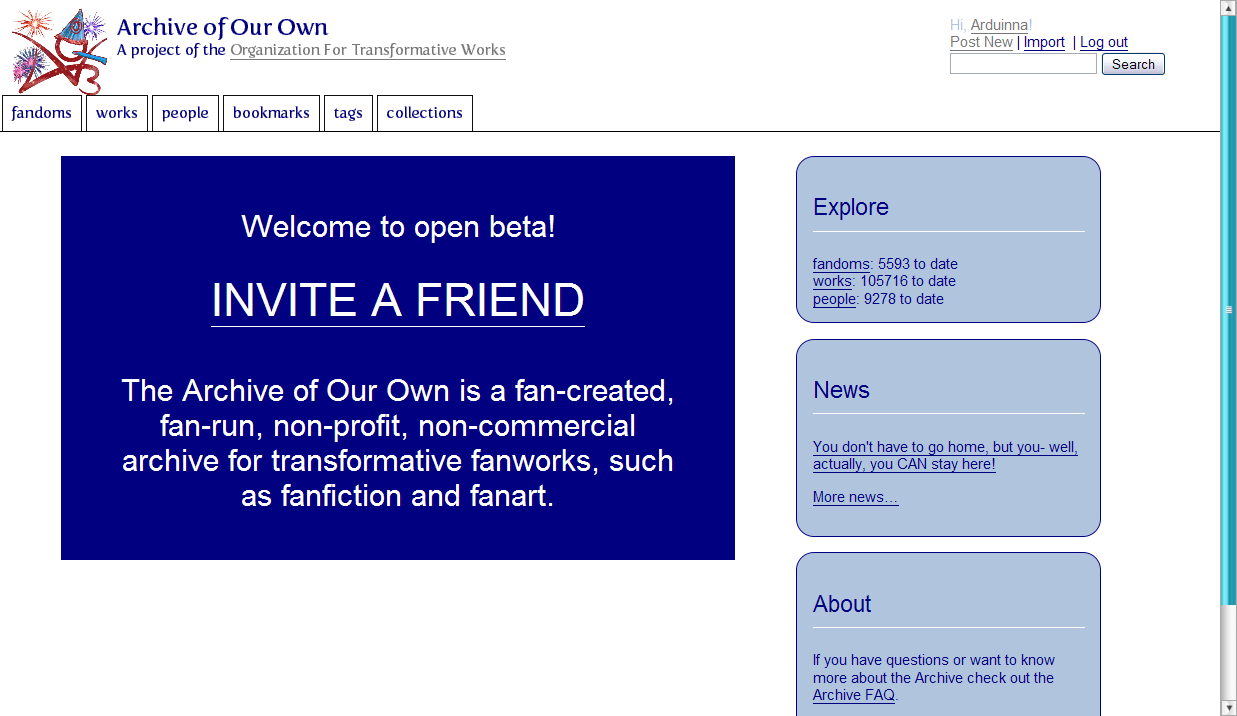
Front page:

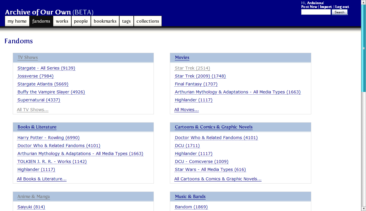
Fandoms by media type page:

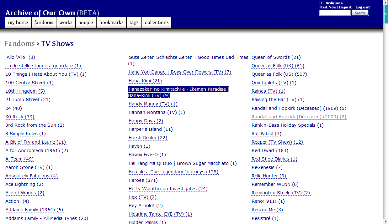
TV Show fandoms:

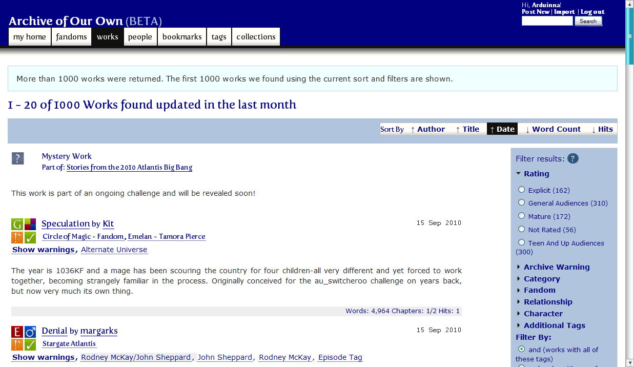
Works listing page:

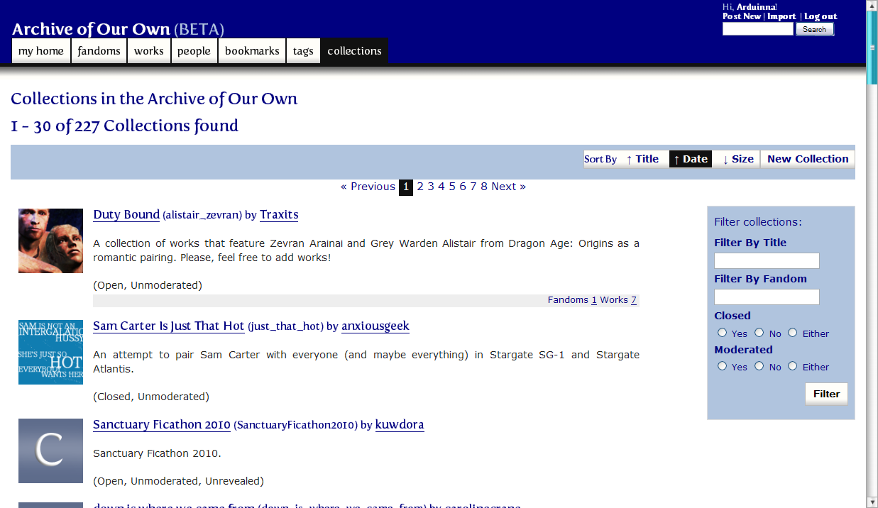
Collections listing:

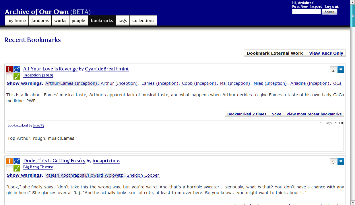
Bookmarks page:

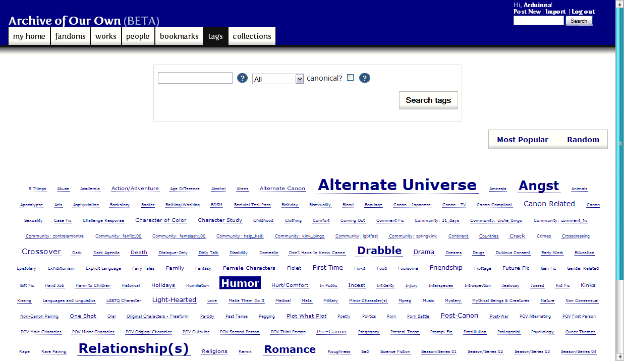
Tags page:

And last but not least, a story page showing the narrower column of text:

And to answer the question I know at least a few people will want to ask, this is how you increase the margins on story text so it's not sprawling across almost your entire browser:
#chapters { margin-right: 10%; margin-left: 10%; }
Those are the settings from the screencap, to give you an idea of what percentages you want to play with.
Yay for skins!
Longer version:
The AO3 threw a party yesterday, which I totally forgot to go to, but when I found out there were new skins available I had to check them out. I like the default skin fine, for the most part, but red is really not my color, and there's a whole lot of red in the default.
But by this point I was very keen on having blue, so I copied Cesy's CSS into a new style box, and started tweaking. And realized it has been a very, very long time since I've done anything with CSS. Heh.
But after an embarrassingly long time that involved a ridiculous amount of staring at source code and wondering when I'd lost all ability to figure this stuff out, I finally got blue shades I could deal with, and put black body text back in, and got my user dashboard back over on the left where it wouldn't freak me out, and tweaked everything I could find to tweak, pretty much. \o/
The code isn't pretty -- there are a couple places I had to fudge things pretty severely, and I know I have unnecessary code in there from all my trial and error, and I cannot for the life of me get the red out of the front page nav bar on hover. I have now given up on that and am pretending I meant to leave it there so it would match the logo. Yes. That is totally why there is still red in there.
Also I didn't really change much in the way of layout; mostly I was messing with colors, but I messed with them everywhere, to the point that it's probably still way too blue for most people. *g* All I did in terms of layout was boost the size of titles, authors, and fandoms slightly in works listings (I always want them to stand out just a bit more than they do in the default), increase the spacing on hrs in stories a titch to give more of a visual pause, and make a narrower story column down the middle of the page.
That doesn't mean I'm not going to force lots of screencaps on you, though. *g*
These are from Firefox on Windows; I haven't tested it on anything else.
Front page:
Fandoms by media type page:
TV Show fandoms:
Works listing page:
Collections listing:
Bookmarks page:
Tags page:
And last but not least, a story page showing the narrower column of text:
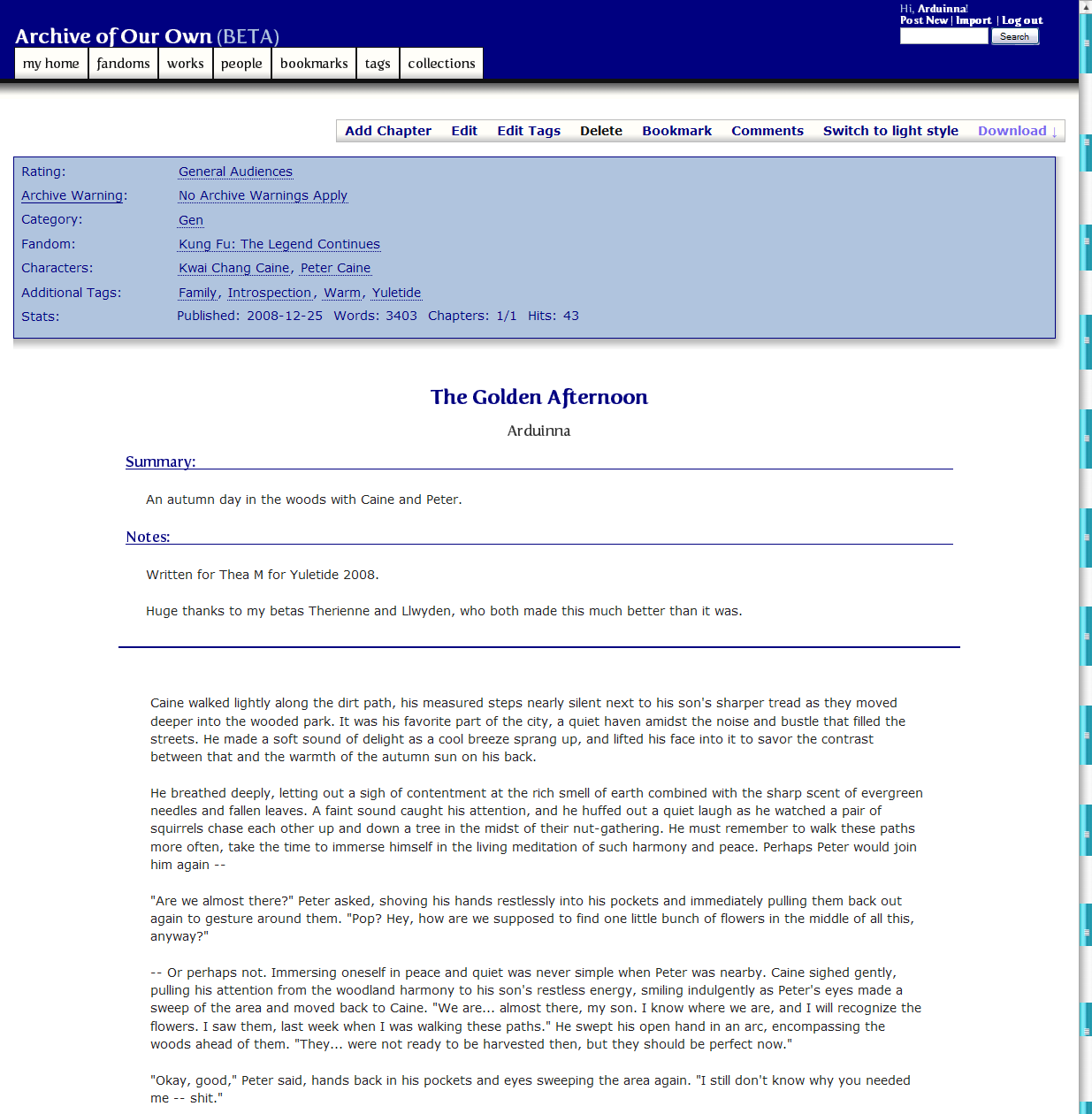
And to answer the question I know at least a few people will want to ask, this is how you increase the margins on story text so it's not sprawling across almost your entire browser:
#chapters { margin-right: 10%; margin-left: 10%; }
Those are the settings from the screencap, to give you an idea of what percentages you want to play with.
Yay for skins!